728x90
1. lightgallery.js
https://sachinchoolur.github.io/lightgallery.js/
lightgallery.js
lightgallery.js V1.0.0 Full featured javascript lightbox gallery, No dependencies. View on github Get a license
sachinchoolur.github.io
2. CSS / JS 연동 (Doc 참고)
<link rel="stylesheet" href="css/lightgallery.css">
<script src="js/lightgallery.min.js"></script>
lightgallery.min.js
0.02MB
lightgallery.css
0.02MB
<article class="column col5">
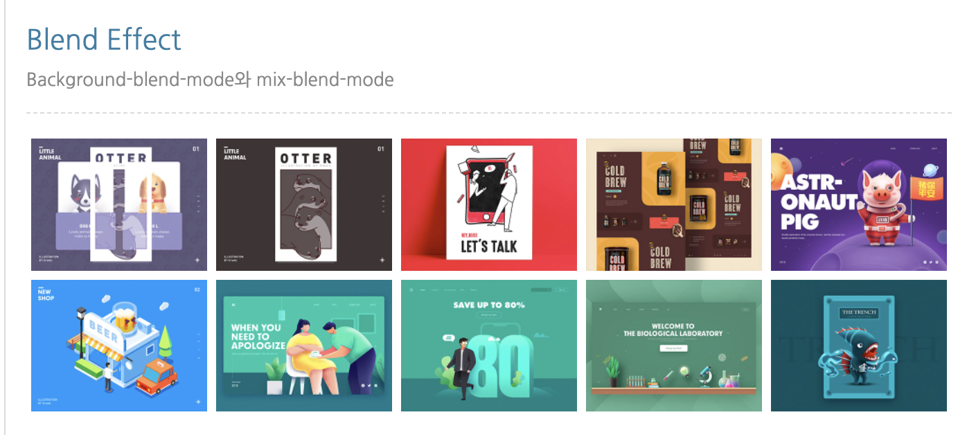
<h4 class="col_tit">Blend Effect</h4>
<p class="col_desc">Background-blend-mode와 mix-blend-mode</p>
<!-- lightbox -->
<div class="lightbox square clearfix">
<a href="img/light01_s.jpg"><img src="img/light01.jpg" alt="이미지"><em>blur</em></a>
<a href="img/light02_s.jpg"><img src="img/light02.jpg" alt="이미지"><em>brightness</em></a>
<a href="img/light03_s.jpg"><img src="img/light03.jpg" alt="이미지"><em>contrast</em></a>
<a href="img/light04_s.jpg"><img src="img/light04.jpg" alt="이미지"><em>grayscale</em></a>
<a href="img/light05_s.jpg"><img src="img/light05.jpg" alt="이미지"><em>hue-rotate</em></a>
<a href="img/light06_s.jpg"><img src="img/light06.jpg" alt="이미지"><em>invert</em></a>
<a href="img/light07_s.jpg"><img src="img/light07.jpg" alt="이미지"><em>opacity</em></a>
<a href="img/light08_s.jpg"><img src="img/light08.jpg" alt="이미지"><em>saturate</em></a>
<a href="img/light09_s.jpg"><img src="img/light09.jpg" alt="이미지"><em>sepia</em></a>
<a href="img/light10_s.jpg"><img src="img/light10.jpg" alt="이미지"><em>Mix</em></a>
</div>
<!--//lightbox -->
</article>/* 라이트 박스 */
.square a {float: left; width: 19%; margin: 0.5%; position: relative; overflow: hidden; }
.square a img {width: 100%; display: block;}
.square a em {
background: rgba(0,0,0,0.77); color: #fff; width: 100%; text-align: center;
position: absolute; left:0; bottom: -30px; opacity: 1; transition: all .3s ease;}
.square a:hover em {bottom: 0; background: rgba(0,0,0,0.5); }
.square a:nth-child(1):hover img {filter: blur(2px);}
.square a:nth-child(2):hover img {filter: brightness(50%);}
.square a:nth-child(3):hover img {filter: contrast(10%);}
.square a:nth-child(4):hover img {filter: grayscale(100%);}
.square a:nth-child(5):hover img {filter: hue-rotate(120deg);}
.square a:nth-child(6):hover img {filter: invert(100%);}
.square a:nth-child(7):hover img {filter: opacity(10%);}
.square a:nth-child(8):hover img {filter: saturate(10%);}
.square a:nth-child(9):hover img {filter: sepia(120%);}
.square a:nth-child(10):hover img {filter: sepia(120%) hue-rotate(120deg);}
3. 완성 모습
'내마음대로만들어보자 > CSS' 카테고리의 다른 글
| 이미지 슬라이드 - slick.js (0) | 2022.04.17 |
|---|---|
| 한줄효과 / 두줄효과 (0) | 2022.04.15 |
| position - absolute, relative, static, fixed (0) | 2022.04.12 |
| 가상요소 (::before , ::after) (0) | 2022.04.11 |
| box-sizing (0) | 2022.04.10 |

